| Input |
Output |
| x |
data y |
| 0 |
6.6 |
| 1 |
9.3 |
| 2 |
9.2 |
| 3 |
11.5 |
| 4 |
12.9 |
| 5 |
15.2 |
| 6 |
14.4 |
| 7 |
17.5 |
| 8 |
19.3 |
| 9 |
19.8 |
|
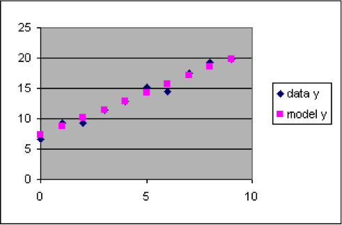
The dataset to the left has a relationship between x and y that is approximated by the linear formula y = 1.4 x + 7.3. This formula can be used to compute model y values for each of the rows of the dataset, which we will put into column C next to the corresponding output data y value so that we can easily compare them.
- Insert a new worksheet into a spreadsheet.
- Copy the dataset so that the x and y values go into columns A and B, with the numbers starting in row 3. (That is, cell A3 will be 0 and B3 will be 7.41)
- Put the labels “Model” into cell C1 and “model y” into cell C2.
- Put the formula “=1.4*A3+7.3” into cell C3. (The result for C3 should be 7.3)
- Spread the formula in C3 down column C to C12, next to all the data values in column B. (The results should be 8.7 for C4, 10.1 for C5, 11.5 for C6, etc.)
- Select the rectangle from A2 to C12, and make a scatter plot.
|